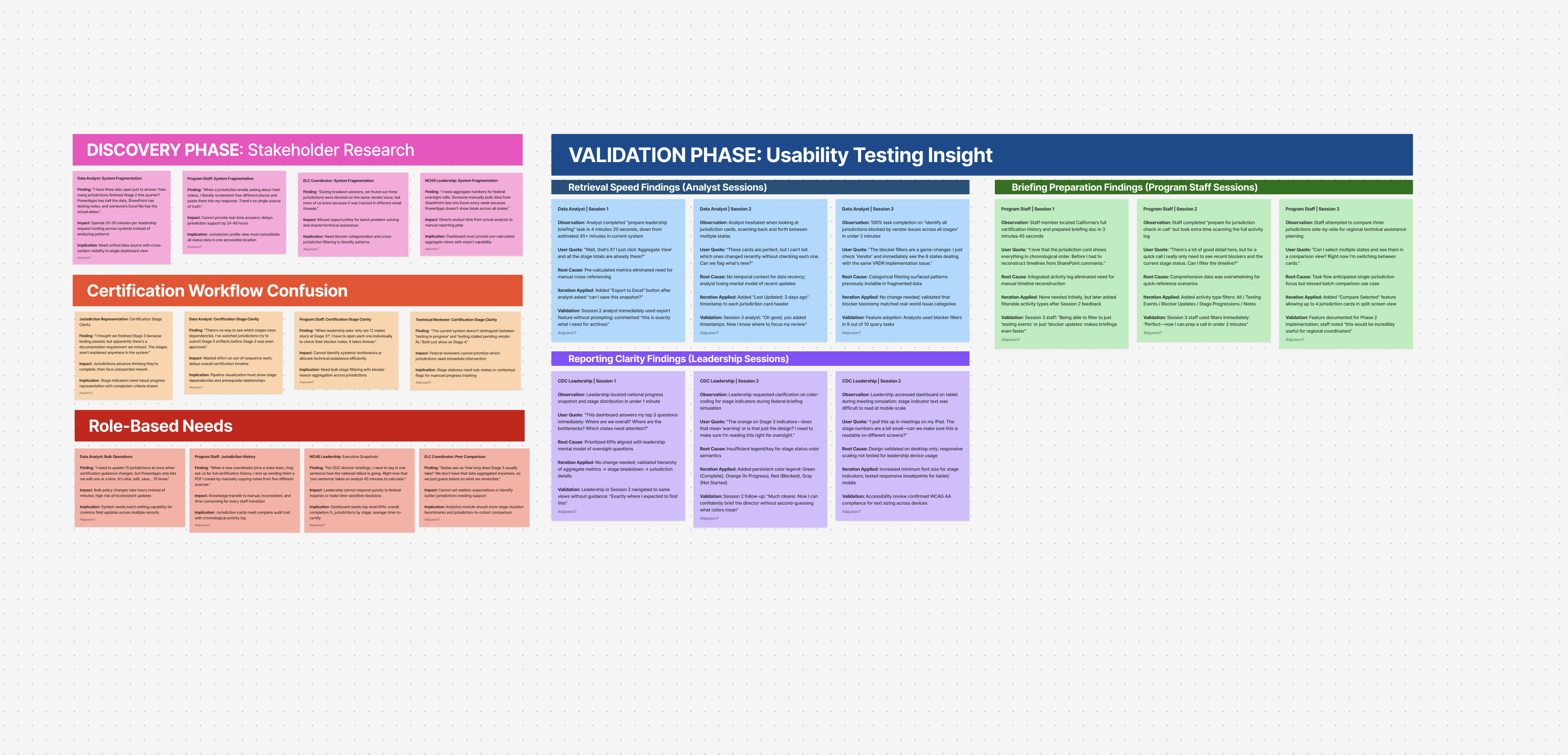
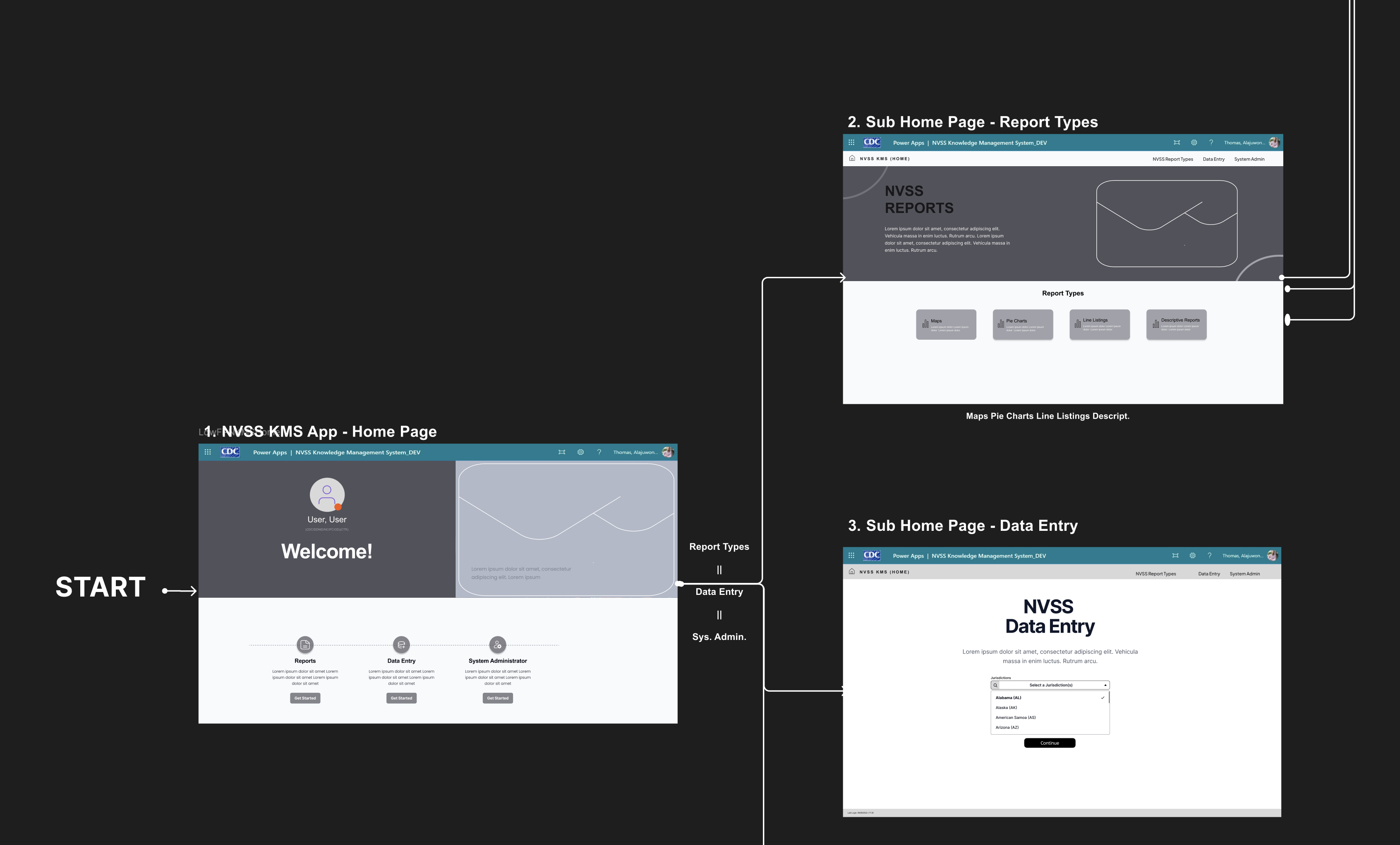
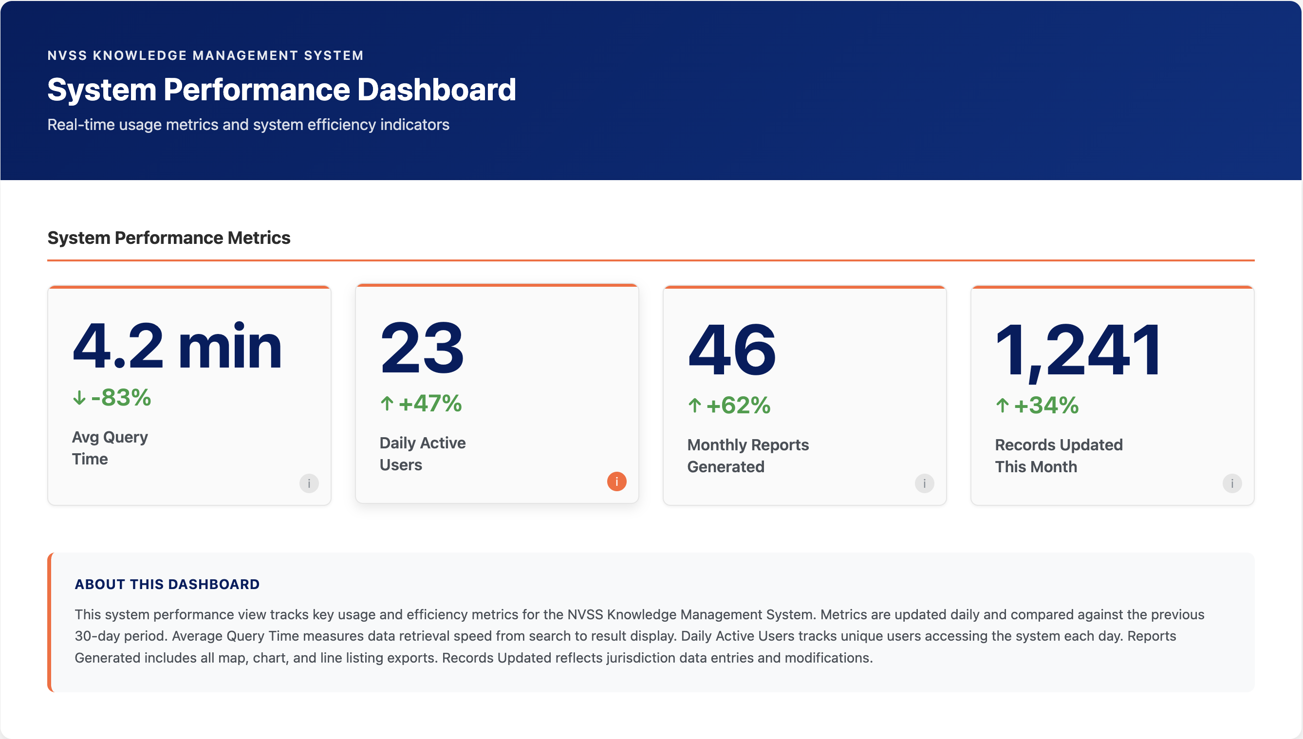
Back to portfolio
This case study reflects work completed as a employee for CTE Inc. Under contract for the Centers for Disease Control and Prevention (CDC) - NVSS/NCHS Division. Due to strict affidavit and NDA requirements, some artifacts and sensitive details have been omitted from this case study.

Case Study

CDC Data Modernization Dashboard

Project TypeEnterprise Dashboard
Version18 Months
RoleLead Product Designer
Tools Used
FigmaFigJamPowerBiSharepoint database
ClientNVSS-NCHS

Project Overview

Quick context before the deep dive.

The Challenge

The NVSS/NCHS needed a centralized dashboard to track 57 jurisdictions’ progress toward FHIR certification, but the landscape was chaotic. Certification guidance across the six stages was still in flux, state-level leadership turnover left new VRO staff unsure of their true status, and many jurisdictions relied on vendors to kick off pre-certification steps—creating critical visibility gaps. The team required a single source of truth to understand where each jurisdiction stood and who needed targeted outreach.

My Role

I led discovery through delivery for the NKMS-tracking dashboard: facilitated sessions with stakeholders to document the evolving six-stage workflow, designed filterable views that surfaced jurisdictions by certification stage and barrier type (vendor dependency, system upgrades, leadership transitions), and built PowerApps reporting interfaces that stayed aligned with guidance even as that guidance matured.

Outcome

NCHS leadership gained real-time visibility into FHIR modernization progress and shifted to targeted outreach. 100% of jurisdictions completed an NVSS/NCHS testing event, 14+ states are now live with FHIR, and another 25+ are actively progressing from pre-certification into certification.

100%

Testing participation

The Problem

Without centralized tracking, outreach was reactive instead of strategic. Analysts couldn’t distinguish between a jurisdiction waiting on a vendor versus one whose program lead had just changed and needed re-onboarding. Tentative certification timelines created a false sense of flexibility—jurisdictions delayed action, assuming they had more runway than they did.

When it came time to accelerate compliance, the team had no way to prioritize who needed a quick nudge versus who required hands-on support. Every follow-up demanded manual investigation before a single email could be sent.

ProblemsSolutions

7+ nested sidebar sections with no clear starting point

4 role-based entry points on the home screen

Leadership transitions = lost context on progress

Prominent contact cards + status headers per jurisdiction

Can't distinguish blocker types for outreach

Structured blocker-type tagging + priority levels

Data scattered across PowerApps, Excel, email

Single dashboard with real-time metrics + funnel

Briefing leadership took 11+ minutes of prep

Click-to-drill metrics with trend indicators

Process & Approach

Step 01

Step 01 — Discovery & data collection

Interviewed NCHS leadership, facilitated ELC breakout sessions, and captured jurisdiction feedback from testing events. Mapped the six-stage certification workflow plus every tracking artifact—PowerApps, spreadsheets, SharePoint lists, and email threads—to expose where information fell through the cracks.

See more

Research Activities

  • Conducted 12 stakeholder interviews across NCHS leadership, ELC coordinators, and data analysts
  • Facilitated 3 ELC breakout sessions with jurisdiction representatives during testing events
  • Documented 47 pain points in the existing workflow through screen recordings and user walkthroughs
  • Mapped information flow across 4 disconnected tracking systems

Key Insights

  • Task fragmentation: Users needed 8+ clicks across 3 different systems to prepare for a single leadership briefing
  • Certification stage confusion: The 6-stage pipeline wasn't clearly visualized, causing missed dependencies
  • Role-based needs: Analysts needed bulk data views; program staff needed jurisdiction-specific histories; leadership needed aggregate progress snapshots
Overview board combining discovery, validation, and program staff insights.
Step 02

Step 02 — Design system & dashboard redesign

Turned discovery insights into a Figma system of reusable patterns—stage indicators, blocker filters, jurisdiction cards, and data input panels. Partnered with a PowerApps developer to replicate the system, streamline legacy screens, and add net-new flows that closed functionality gaps.

See more

Design System Components Created

  • Stage indicator patterns covering all 6 certification stages with clear progress states
  • Blocker filter modules that highlight technical, vendor, and policy categories
  • Jurisdiction profile cards that standardize data display across 57 jurisdictions
  • Data input panels templated for PowerApps-compatible forms

Navigation Paradigm Shift

  • Before: Jurisdiction-first structure scattered task-specific data across tabs
  • After: Task-first navigation with role-based entry points
Design system components for certification dashboard
Step 03

Step 03 — Validation & iteration

Ran validation sessions with analysts, program staff, and CDC leadership to test retrieval speed, data accuracy, and reporting clarity. Iterated until teams could locate jurisdiction data and brief leadership in under five minutes—down from multi-step hunts across disconnected sources.

See more

Testing Protocol

  • Validation sessions with data analysts (focus: retrieval speed)
  • Sessions with program staff (focus: jurisdiction briefing preparation)
  • CDC leadership reviews (focus: reporting clarity for federal oversight)

Measurable Outcomes

  • Reduced leadership briefing prep time from 45+ minutes to under 5 minutes
  • Eliminated need to cross-reference external spreadsheets for 89% of common queries
  • Achieved 100% task completion rate for jurisdiction status lookup across all user groups

Iteration Examples

  • Added “last updated” timestamps after analysts requested change tracking
  • Introduced bulk filter presets when program staff needed to quickly identify stage combinations
  • Refined stage indicator colors based on accessibility feedback
System performance dashboard showing consolidated progress tracking metrics

Design Showcase

Artifacts that prove the evolution of the system.

Discovery

Discovery artifacts highlighting research insights and themes. Open in Figma ↗

Discovery

User journeys and early synthesis from discovery workshops. Open in Figma ↗

Discovery

Detailed research board showing pain points and opportunities. Open in Figma ↗

Discovery

Consolidated discovery artifacts for stakeholder alignment. Open in Figma ↗

Flow Chart

Dashboard redesign layouts applying the design system across views.

Low-Fi

Stage indicators, filters, and jurisdiction cards from the system.

Hi-Fi Redesign

Extended components and dashboard templates within the system.

Hi-Fi Redesign

Interaction-heavy dashboards applying the system across multiple views.

Hi-Fi Redesign

State variations and data panels within the design system.

Hi-Fi Redesign

Extended dashboards with data panels and navigation built on the system.

Hi-Fi Redesign

Micro-interaction patterns and status treatments within the system.

Hi-Fi Redesign

Component variations and layout explorations for certification workflows.

Hi-Fi Redesign

Composite dashboard views showing end-to-end system application.

Hi-fi

Screen recording artifact for the jurisdiction modernization tracking and outreach initiative.

Results & Impact

Quantifiable proof the redesign mattered.

89%

Faster briefing prep

Leadership reports reduced from 45+ minutes to under 5 minutes.

40%

Fewer clicks per session

Centralized navigation reduced repetitive interactions across reports.

100%

Error elimination

Dataset confusion incidents dropped from 2-3 monthly to zero.

5→1

Systems unified

Replaced fragmented tracking across 5 disconnected tools with single dashboard.